• Design Portfolio
  • Resume
  • What's New
  • Papercraft Models
  • Archives
  • About Me
Menu

Rocky Bergen

ARTIST & DESIGNER
  • Design Portfolio
  • Resume
  • What's New
  • Papercraft Models
  • Archives
  • About Me

Arduwatch - Naturals Line - Orange and Green

Bergen - Arduwatch Design

March 5, 2022

I am a fan of tiny portable handhelds, and one if the coolest and smallest, is the Arduboy, a 1-bit miniature game system. It’s the size of a credit card and features this impossibly crisp display. I bought a Arduboy a long time ago and still enjoy playing around with it today. I have also been making mock Arduboy game graphics for a years and I guess I saw this project as a chance to combine a number of new skills and interests with some legacy designs and assets to see what would come of it.

The Arduwatch is an imagined “fantasy” product design that combines the screen and internals of an Arduboy with the form factor of a wristwatch. The Arduboy’s form factor and further reduced by eliminating all but the systems directional buttons. I imagined different games and applications that could work with this reduced control set.

As an aspiring watch designer, my hope is this design would resonate both with vintage tech and a watch enthusiasts alike.

Arduwatch - Brights Line - Slime and Pink

Arduwatch - Black (Brights), White (Naturals)

When the design was complete, I started to play around with different colourways. The Naturals Line features muted Autumn and Winter tones inspired by nature. The Brights Line is about 90’s toys and youthful energy. Each palette combo pairs beautifully with the super sharp high contrast Arduboy display.

Arduwatch - Green Detail - BC’s Quest for Tires.

This design was modelled using a combination of Fusion 360 and Cinema4D. These images were rendered using Adobe Substance Stager. I prefer Fusion’s geometry for building solid surfaces but I am more familiar with Cinema’s interface and toolkit for any finessing that may need to be done. Cinema also seemed to be the logical choice when it came to creating a flexible strap (one can only avoid the beginner’s modelling traps for so long). My computer is not really powerful enough to handle Substance’s requirements and “too much” model geometry causes some very glitchy behaviour. This is not the end of the world, I can still concentrate on building better, more viable models, though the output quality may need to be adjusted.

Arduwatch - Naturals Line

Orange Detail - Casio Homage LCD

Pink Detail - Tamawatchi

Arduwatch - Brights Line

I hope you enjoyed having a look at this Arduwatch design. I had a great time with this concept and I might even revisit it again another time. Do you have an Arduboy? Would you wear an Arduwatch? Do you recognize any of the games on the watches? What games would you add? Any colour combos? Let me know in the comments below!

In Arduboy, Design, Industrial Design, Mock-up, Prototype, render, Retro, watch, watch design, arduwatch Tags arduboy, arduino, arduwatch, 1bit, watch, watch design, watches, vintage, design, mock-up, render, industrial design, product design

Book Box is a system of tiny outdoor library kiosks distributed throughout a city area.

Book Box - Mini Outdoor Community Libraries

February 26, 2022

I was first inspired to create an outdoor library kiosk one afternoon back last summer while going for a walk around my neighbourhood. I stumbled upon a house that had a “tiny library” box in their front yard. I always like to take a peek into these libraries whenever I run across one. It then dawned on me that I had never seen a standardized/manufactured example of one of these boxes so after some confirmation on Google that these were not commonly available, I set out to create my own design.

Book Box features an LED light box to welcome users and to provide any desired information.

Book Box are enclosed steel shelving structures design to hold books safely in a variety of weather conditions. These kiosks are most ideal for public spaces such as parks, community centres, plazas, schools, walking neighbourhoods. Rolling shutters can be used to securely close the unit in after hours or extreme weather conditions.

Book Box has shutters that can be used in after hours and bad weather scenarios.

This design was created using Autodesk’s Fusion 360 software under their Hobbyist license. This license gives a user near unfettered access to the software and is highly recommended to anyone who might want to dip their toes into the manufacturing space with a minimum amount of spend or effort.

Personally, I really dig the surreal aspects of bringing something novel and foreign into the world. With my current toolkit, moving from inspiration to representation is easier and faster than ever.

Would you like a Book Box in your area? Where would you put them? What opportunities for design improvement can you see? Any concerns? Please leave a comment below and let’s have a discussion about this.

In library, public art, art, Industrial Design, metal fabrication, Prototype, render, Mock-up, Design, charity Tags library, public space, public art, installation, industrial design, outdoor structure, autodesk, fusion 360, Book Box, community library, Library

Cat in a pod in a loft

Cat Pod - Cat Shelter Design

February 12, 2022

I love cats, so every few months I try to think of a project for them. I have designed a couple of different play structures and a cat bed so far. Today, I introduce Cat Pods, made from 4mm thick paperboard in a variety of different colourways.

Learning 3D is helping me to design objects that would have been practically impossible to illustrate or fully conceive using only 2D tools. Building out the cross-sections that make up the shape of this pod enclosure involved several back and forths between my 2D and 3D tools.

Optional cat ears can be added for charm.

The shelter keeps your kitty safe from attackers.

Plenty of room at the front of the pod for an easy escape.

One of the benefits to building the pod out of heavy paperboard is how much stronger the pod is compared to a regular cardboard box. The pod maintains much of the smell and feel of a cardboard box while being more secure. If your cat is a loafer than this pod might be exactly what they need. While keeping you cat secure, the entrance to the pod is still large enough so an escape path is available if another kitty decides it is their turn to get in.

Another benefit to paperboard is the number of colours that can used to give the pods some exceptional flair. Below please consider the Allsorts and Goochee variants.

Get psychedelic with the Allsorts colourway.

Extra comfy kitty in the Goochee colourway.

The top of the pods can be removed if the pod needs cleaning or you kitty doesn’t like to be so snug. Other top shapes and complimentary colours could be developed to further increase the look and flexibility of these units.

Top of the pod can be removed for easy cleaning and variety.

If you have a cat, do you think they would use and enjoy a Cat Pod? What colours would you like to see next? Any other ideas as to how I might enhance this design? I am always exploring designs and will eventually return to older ones when I have new skills or information to consider.

Thanks for joining me and feel free to leave a comment below!

In cats, render, Prototype, Industrial Design, Design, art, paperboard Tags cat, cats, cat pod, cat house, play structure, design, industrial design, cat toys, mock-up, paperboard

LT-65 was designed as a portable Commodore back in the 2010

Commodore 65 - Laptop Design - 65-LT

February 5, 2022

I was approached by a company back in 2010 to help develop a portable computer in the spirit of the Commodore 65. While I wish the experience had been more positive, I ultimately left the team and took my design with me. Now, over 10 years later, I finally have the 3D modelling skills to more fully flush out some of my old designs. The 65-LT is a love letter to the Commodore 64C design era.

As this is a design from over 10 years ago some of the modern port standards are a little out of date.

I always loved my Commodore 64C. I grew up with the breadbin like most kids, but I liked the refresh even if it wasn’t much of a value proposition. Ultimately for me, it was a last hurrah for the mighty machine. The design sensibilities also lent themselves to a cool laptop aesthetic.

Keyboard is the hybrid of all the Commodore keyboards of the era and beyond.

I looked at all the keyboards Commodore developed from the C64-C era onward, including the PC laptops Commodore released. I feel the layout represents the best balance between legacy and function.

Right side ports.

Left side ports.

65-LT - Case closed.

I would love to continue to develop this one. Nowadays it would be pretty easy to create an authentic yet modern C64/65 experience with a Raspberry Pi or a MiSTer board. Plastic injection molds are not exactly cheap but it sure would be cool to have a modern and fully portable machine dedicated to the experience.

Gaming in the home office.

Would you be interested in one of these machines? If there is anyone out there in a position to discuss further development on this machine I am interested in hearing from you. In any case, I am very excited that I was finally able to show of the design in full. Please let me know what you think in the comments below!

In Commodore, Design, Industrial Design, Mock-up, Prototype, render, Retro, laptop Tags commodore, Commodore, laptop, notebook, industrial design, design, mock-up, 3D

The New Vintage Chronograph blends modern styling with plenty of vintage cues.

Bergen Watches - New Vintage Chronograph Design WIP

June 20, 2021

I am pleased to present my latest New Vintage Chronograph watch design. I am very happy how this design turned out. This is also the first example of a design that I have brought into the third dimension with Cinema4D. I am new to C4D and basically 3D in general, but the individual elements of watches are made up of basic enough shapes which allowed me to learn the software and produce these renders in 5 days of spare time. These 3D renders allow the viewer a better representation of the overall shape and feel of the design.

The Bergen NV Chrono features the following:
- 316L Stainless Steel case construction
- 40mm diameter case (42mm with crown)
- Seagull ST19 movement
- Double-domed Sapphire
- 20mm strap size
- 46mm lug-to-lug
- 11.5mm thickness (hopefully)

Great proportions and overall legibility.

Great proportions and overall legibility.

Side view - “B” mark on crown.

Display case showing off the ST19 movement.

Everything on this watch including all fonts and styling is completely scratch built. I find it a bit annoying when I see very expensive watches using off-the -shelf type-styles. The hope is that with each successive design I will begin to further hone in on my brand’s DNA.

Lume shot.

Close up of the dial.

Below you can see the design roadmap. Before I started learning C4D, this would have had to be considered a complete design. Now that I am beginning to gain my own 3D skills, I will be in a better position to show concepts more fully, both to the general audience and to myself. I look forward to have more time to play around with different materials and finishes and ultimate really “sell the design”. This first attempt has been an amazing growth experience for me personally.

If you like what you see, please consider leaving a like and a comment below. I am open to hearing any thoughts you may have.

In Design, Industrial Design, Mock-up, render, watch, Retro, Prototype Tags design, watch, watches, Rocky Bergen, industrial design, watch design
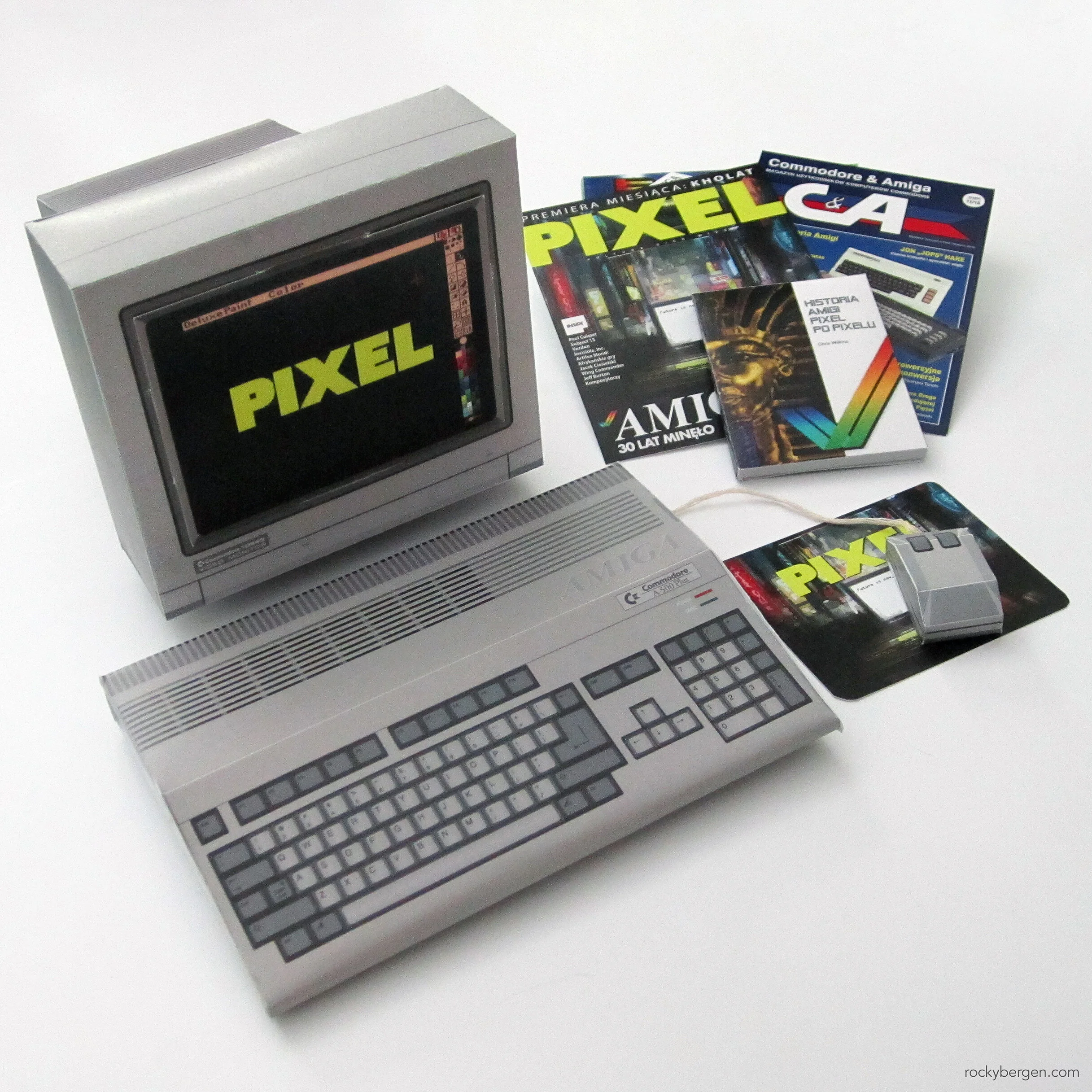
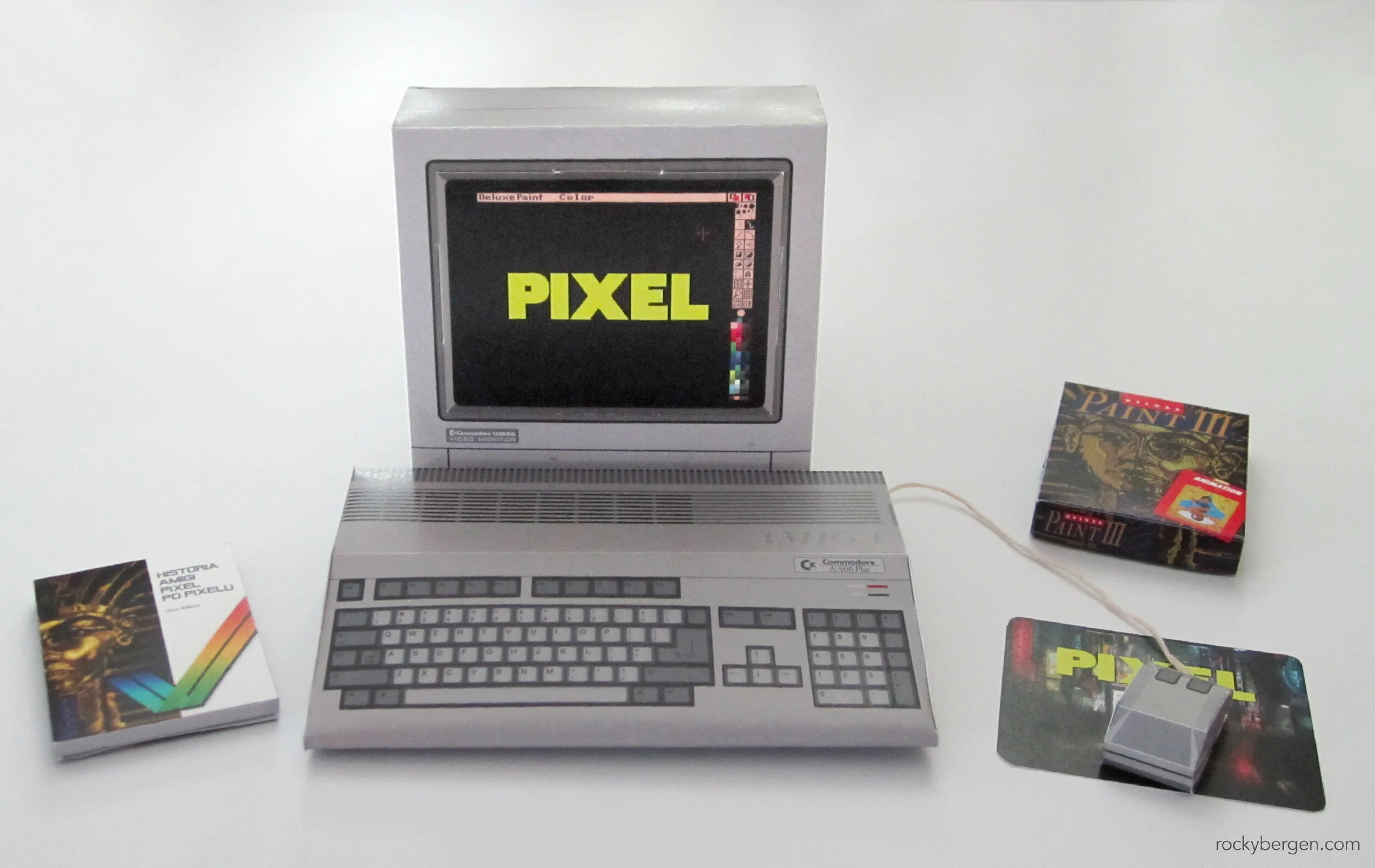
Polish fans will recognize the Pixel brand in today’s papercraft and many will also be familiar with the retro publications released by Chris Wilkins.

Polish fans will recognize the Pixel brand in today’s papercraft and many will also be familiar with the retro publications released by Chris Wilkins.

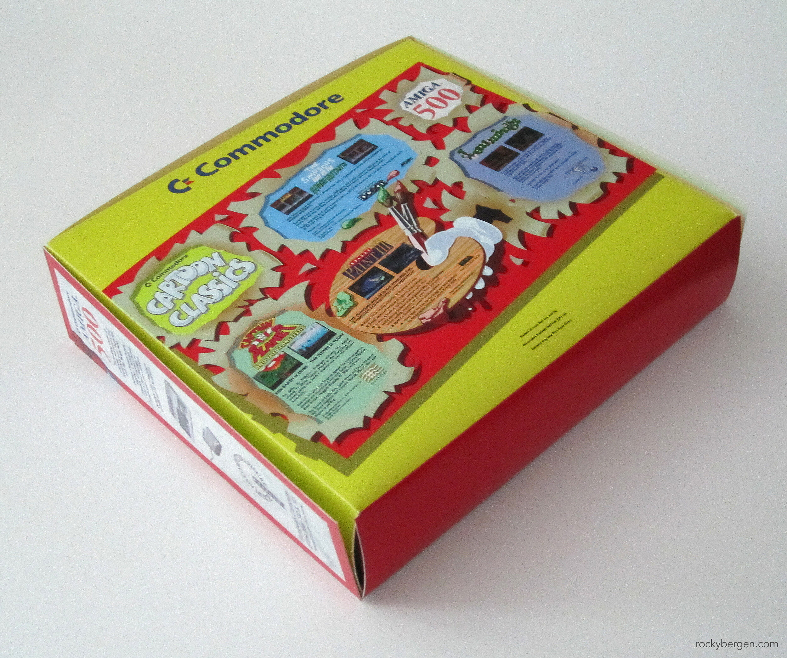
Amiga Cartoon Classics Papercraft

June 12, 2021

If you are at all familiar with the retro scene chances are fairly good you’ve come across Retro Fusion Books. Many of you will be familiar with Chris Wilkin’s popular “In Pixels” series of books (I have a few). Robert Łapiński at Pixel is heading a Kickstarter-like project for a Polish translation of the popular book, The Story of The Commodore Amiga in Pixels. This model was requested as a stretch goal reward and as a result this model is currently not available as a free download on my site. **To receive a copy of this design you will need to take part in the Polish campaign.

Amiga Cartoon Classics was exclusive to Europe.

OMG so much text and imagery to recreate. Slow and steady… I am pretty happy with how this turned out.

OMG so much text and imagery to recreate. Slow and steady… I am pretty happy with how this turned out.

I currently work as a package designer so naturally I am as interested in the actual packaging of retro systems as I am in the industrial form factors. In the case of Cartoon Classics, it is much more colourful than any other papercraft else I have ever created.

New to this model is the addition of the A520 composite adapter and the power brick.

The packed is photographed with the enhanced Amiga 500 as it was sometimes included in the UK bundle.

Everything fits in the box!

This model also contains all the interior packaging to hold all the contents of the bundle. Once your are done playing with your tiny retro computer everything can be tucked away neatly in this tiny box.

The ultra mega-hit that took the Amiga community by storm, Captain Planet.

I rented Bart vs. the Space Mutants for the NES when I was a kid.

Here are the tiny game boxes.

The inclusion of these little boxes and diskettes helps to complete the illusion a tiny computer on your desk.

Special Polish add-ons are included in the papercraft which include a mini Historia Amigi Pixel Po Pixelu and other Pixel publications.

Special Polish add-ons are included in the papercraft which include a mini Historia Amigi Pixel Po Pixelu and other Pixel publications.

To help round out the project, I have included a number of Polish exclusive materials including the forthcoming “Historia Amigi Pixel Po Piexlu” and a few Pixel publications.
Robert at Pixel suggested that I include a couple of Polish developed games, namely Franko and Teenagent. I was not familiar with either but I am glad I got to know them. Franko especially appeals to my high school sense of humor. I plan on trying this game out for myself.

Two Polish developed games were special-requested and I am so glad they were suggested. They both appear to be excellent games “in their own unique way”.

Franko needs a 2021 HD remaster if any ever has.

I watched a great deal of playthru footage of this one too.

I hope you enjoyed the tour of my latest papercraft and if you are one of my Polish-speaking fans, I would strongly consider you check out the Amiga book campaign. The Chris Wilkins books at Retro Fusion Books are excellent and there are loads of stretch bonuses that have already been achieved so you can expect a pretty handsome package if you order!

Special thanks to Robert at Pixel, Chris at Retro Fusion Books, and everyone involved in this project.

In Amiga, Commodore, Design, paper craft, papercraft, Retro Tags amiga, Pixel, Polish, Poland, commodore, retro fusion books

Watch Design Progress

July 30, 2020

I have been trying to build my watch design skills for for several years now. My goal is to design easy to read, design-forward pieces that will stand out in a crowd for both their looks and build quality. I part of my design process I have begun to exploit my papercrafting skills to create true-to-scale paper representations. I am also beginning to swap out textures as you can see in the images below. These are not meant to be final colourways as much as to test the design against different colours and contrasts.

This is the 84th version of my pseudo-octagonal watch design. I would not be surprised if it continues to evolve for a while. It is currently sized at 38mm with 20mm bracelet or strap. What do you think of this watch? Would you wear something like this? Let me know in the comments below!
In Design, Industrial Design, Prototype, watch Tags watch, watches, design, industrial design, octo, timepiece, horology

The BBC Microcomputer was a staple of computer literacy for kids growing up in the 80’s in the UK.

BBC Microcomputer - Papercraft Design

June 17, 2020

The download to the BBC Microcomputer model is available at the bottom of this article.

I grew in Canada in the 80s and spent my elementary school years surrounded by Apple II computers. While not an official government scheme, I suspect many North American school kids my age will have seen the Apple’s as the school computer, often having cheaper 8-bits at home.

In the UK, the push towards computer literacy was a deliberate government effort. Computers were seen as the future and that every child should know how to use one. As a way to help realize this, a call to action was issued to all the major electronics manufacturers to help create a BBC branded microcomputer that would be distributed to school’s across the country.

Sinclair Research were seen as the obvious choice for the job but through a series of mishaps, the award was ultimately given to former partner turned rival Acorn Computers. Anyone who is interested in learning more about this whole fiasco, I suggest checking out the endlessly entertaining movie, Micro Men.

To accompany the release of Acorn’s new BBC Microcomputer a BBC television program aptly called The Computer Programme, helped lead kids through the inner working’s of the BBC Micro or Beeb for short.

The Beeb was produced by new kid, Acorn Computers.

The rear of the system.

I surveyed a few online communities to find out which computer model I should design next and the BBC Micro was a standout winner. Without access to the online resources, I might have neglected to recognize this computer for the powerhouse it was. Not only was it powerful in its day, it also helped to foster a spirit of digital exploration that can still be felt today. The ARM processor, which is still an essential part for the computer landscape descends directly from the chips Acorn design for the BBC.

Today, the UK born Raspberry Pi exists to help educate students both all over the world and is a permanent fixture in my living room. While I may miss some of the retro goodness of the machines of the 80’s, it is nice to know that similar experiences can still be had by current generations through cheap home computers and ever improving emulation.

While the BBC Micro was known as the education computer, it had plenty of games like Frak seen above.

Chucky Egg was ported to the BBC Micro.

Watch out for Granny in Granny’s Garden.

My personal experience with the Beeb is largely relegated to YouTube videos, the aforementioned Micro Men movie and the excellent talk, The History of the British Home Computer by Author and Tech Historian Tom Lean.

If similar efforts had been made in Canada to educate the youth back in my school days, perhaps my passion for retro computers would be more widely shared inside my country. As it stands, I am glad that there is a reverence for these machines in other parts of the world and that with easy access to a global community, these passions can be shared anywhere.

Promo materials and companion manuals were a popular source of information.

I hope you enjoy building this model as much as I enjoyed making it. In many ways this might be the closest I ever get to touching a real BBC Microcomputer. Please consider dropping a like and sharing your personal experiences with this machine in comments below. I am always looking to learn something new!

You can download the BBC Microcomputer model here.

In BBC Microcomputer, art, Design, Illustration, Industrial Design, paper craft, papercraft, Retro Tags BBC, Microcomputer, 80s, retro, computer, Acorn, paperart, papercraft

Apple Macintosh 128K - The computer that “started it all”, complete with bundled software.

Apple Macintosh 128K - Papercraft Design

May 24, 2020

The free Apple Macintosh papercraft pattern can be found at the end of this post.

The Macintosh came out in January of 1984, just one year after Apple launched the ill-fated Lisa computer. While Lisa introduced early adopters to modern computing, the Macintosh brought these concepts to the masses. Using a graphical interface with a mouse and keyboard is something we take for granted today but in 1984 it was bleeding edge.

The side of the Mac is interesting. I have been informed there is a programmer interrupt switch which can be clipped through the vents. This monitors machine code and is useful in programming. I thought it was a power switch but the community has spoken! :)

I can’t pretend I have a lot of experience with these early Macs. We had Apple II’s in my elementary school and when I was in high school we learnt on XTs and later on 386s. The first time I saw a 128K Mac with my own eyes was in 1996 at my university in one of the computer labs.

Despite have no hands on experience, there is no denying the appeal of this Mac’s form factor. Many of the innovations that appeared in the Lisa a year earlier are back - refined and ready for prime time. It is easy to see how this machine would help usher in a new era in modern computing.

The Mac 128K came with Macwrite and Macpaint. Neither of these are around these days but they served as inspiration for software we commonly use today.

Apple’s packaging also received a more modern look when compared to the Lisa materials. Brand standards were tightened up some to provide a more consistent look and feel throughout. The time-honoured tradition Apple of including Apple stickers with their products seems to have been born with the Mac 128K release. Also, Apple was happy to help you finance your new Mac purchase with their very own Apple credit card (Apple Pay was not the first).

Possibly the most interesting items, were the cassette tapes that Apple provided as a quick start guide for the Mac OS, and the included MacWrite and MacPaint. A multi-media experience was much more literal in 1984 and so creativity (and a cassette player) was required.

Disk drive and disks.

Mac from the back.

Keyboard with optional number pad.

The Mac mouse will have been the first mouse many people will have ever used.

Once again, special thanks goes to my buddy George. He assembled and photographed all the items in this post. With the pandemic keeping me at home, I don’t have access to all the things I need to make these posts. George is both a professional photographer and master paper folder which makes him a valuable and highly skilled ally. You’re the best!

I did my best to limit the game selection to ones that ran on a 128K machine.

I hope you enjoy building this Macintosh 128K. The Apple community has always been super-supportive of my efforts so I am always happy when I can give something back.

For my next papercraft projects, I am working on a highly-requested British computer, and then a highly-requested US computer, followed by another non-computer (but retro) papercraft just to mix things up a bit!

You can download the Apple Macintosh 128K papercraft model here.

In Apple, Macintosh, art, Design, Illustration, Industrial Design, paper craft, papercraft Tags apple, Macintosh, retro, retrocomputer, papercraft, paperart, pattern, design, industrial design, case design

My girlfriend requested a VIC-20. I didn’t know but in the early days she grew up programming on one.

Commodore VIC-20 - Papercraft Design

May 2, 2020

This Commodore VIC-20 pattern can be downloaded at the bottom of this post.

I wanted to send out a tremendous thank you to all the new followers and visitors to the site. I know many people might be looking for: 1. unique things to do 2. at home 3. on a limited budget 4. using available supplies. I feel these models are a great way to spend an evening and learn a thing or two about retro computers. Possibly even build your own retro museum. I try to stay as close to the source materials as I can using images that I usually source from the internet.

Due to the current global health crisis, I am working from home and don’t have access to the tools I use to test build and photograph these models. An extra special thanks to the always amazing George Blanc for doing a test assembly and providing me with the excellent photos for this post. If you are ever looking for a great product photographer (or paper folder), he is one of the best.

I created a Commodore 64 papercraft model as one of my first models and based this VIC-20 model off of that design so all the accessories shown should work with the C64 design as well.

The accessories with this model are size compatible with my earlier C64 design.

When my girlfriend told me she used to have a VIC-20 I did an image search for the different breadbins and asked her which one she had. There were at least three possible candidates but she was probably 10 when she last saw the computer so I decided to make all three (George folded and glued them all - you rule). Apologies to my German fans, I have not made the VC-20.. yet.

Three variations of the Commodore VIC-20 breadbin to suit your personal nostalgia.

Designing early 8-bit home computers can be an interesting experience. Many of today’s standard components like monitors were considered nice-to-have’s in the early 80s. A branded monitor wasn’t marketed to consumers at first so I did my best to replicate the television shown on many of the VIC-20 boxes that graced store shelves. Anyone care to guess what the specific brand/model of television in being used?

Commodore VIC-20 side view.

It’s always a challenge to say when enough is enough as far as the level of detail is concerned. I love doing little accessories like disks, cassettes and in the case of this VIC, some cartridges. The cartridge bay on the back of the pattern is not by default able to accept these cartridges. I try to consider the scale of the models and a general audience when making these designs and I think even George may have balked at the idea of making three keyboards with working cartridge slots. That being said, plenty of people have taken my patterns and pushed them further by making all sorts of working drive bays and ports. It is possible to adapt my designs with some extra imagination. If I had more time, I would release variations of each of these patterns to cater to different skill-levels. As you can see, the papercraft collection keeps growing so given enough time, I feel anything is possible!

Commodore VIC-20 rear with 16K RAM Expander cartridge.

Commodore VIC-20 rear with 16K RAM Expander cartridge.

Hopefully I can get my girlfriend a real VIC-20 someday soon but in the meantime I hope she will accept my (erm, and Geroge’s) gift of the papercraft VIC.

Thanks again to the community for your many suggestions of computers to do next. I have assembled a list of the “Top 5 most-requested computers” and was surprised and excited by what I saw. Do you want to know what the next five designs are going to be? Let me know in the comments below. I am willing to share but can keep it a surprise if that’s what you’d prefer. ;)

You can download the Commodore VIC-20 papercraft model here.

In Commodore, Design, papercraft, paper craft, Industrial Design, VIC-20, art Tags commodore, VIC, VIC-20, paperart, papercraft, retro, retrocomputer, computer, relationship, community, download, pattern, pepakura

Bergen Octo - Stainless Steel Watch - Front View - Latest Version

Bergen Octo - Stainless Steel Sports Watch Design

April 11, 2020

The Bergen Octo is an octagonal watch design I have been playing around with for the past few months now. Pictured above is the most recent version of the design to pass judgement at the “Bergen Watch Factory” which only really exists as an ongoing design exercise. Watches while simple to grasp as an object require a great deal of refinement to feel like an everyday accessory. This design has undergone roughly 60 iterations since I sketched the basic octagonal sketch over my lunch break back in January.

Bergen Octo - Watch face and bezel development

One of the challenges I face is working in Adobe Illustrator. If I had it to do over again, I most certainly would be learning Solidworks and earning a Product Engineering degree. Everytime I need to make an adjustment to a bezel edge, I am doing so manually. Rather than going completely from scratch, I am building the watchcase, face, bezel and other items to work with actual movements using accurate measurements. This limits some of the case shapes possible helps to grow my understanding of case design.

Bergen Octo - Case shape and styling -- Evolution

Paper mock-ups to help provide a sense of scale.

When I decided I was going to spend more time with watch design, I told myself I was going to start conservatively and respect the classics. So how did I land up with this decidedly retro and kitschy piece loud steel? I guess, I am not very good at following instructions, especially when they come from myself. I guess at the end of the day, I am happy to follow my bliss and hope to develop my watch design language along the way.

Bergen Octo - Bracelet and lug development

I got in touch with a few Chinese manufacturers to see about the logistics of building watches from these designs and they seemed to think it would be possible, so that is encouraging. I have considered having a buddy help me 3D print a basic case shape so that I could strap it to my wrist and get a better sense of presence.

Bergen Octo - Early Quartz iteration - Colorway considerations

While the top most image in this post represents the most refined example of these designs, there are things that I like about each of these designs. Ultimately, I am looking for the design that conveys the most harmony and is free from visual tension. Lots of pushing and pulling of assets in terms of scale and contrast.

Bergen Octo - Blueskying other potential derivative designs

For every good idea, there has to be a dozen weird ones. Glad I have enough time in the day to think of a few of those too. Below please behold the Tamawatchi.

Bergen Octo - Tomawatchi

I need to see this watch with “fresh eyes” which means I will be putting this project down for a few weeks and work on another retro paper craft project. So please stay tuned for that coming out near the end of this month if everything goes according to plan!

In watch, Industrial Design, Design, Mock-up, Prototype, Retro Tags watches, stainess, steel, nh35, seiko, watch, automatic, quartz

LisaGraph detail

Before Macintosh: The Apple Lisa - Documentary Intro Sequence

February 19, 2020

I recently completed an intro sequence for David Greelish’s upcoming documentary Before Macintosh: The Apple Lisa. As my familiarity of the Lisa focuses on the system’s design language, I decided the best way to highlight the innovations of the the Lisa was through The Lisa Office System.

The Lisa Office System is a collection of seven applications similar to Microsoft’s Office Suite which included LisaWrite, LisaCalc, LisaDraw, LisaGraph, LisaProject, LisaList, and LisaTerminal. These tools would give most user’s everything they would need for common office tasks.

Even today, Microsoft’s suite bears a strong resemblance to Apple’s Lisa collection.

LisaList Detail

LisaWrite detail

LisaCalc detail

The Lisa Office System

These graphics are my 2.5D interpretations of The Lisa Office System box artwork which animate onto the screen in a “flat gridland” all building to the reveal of the Lisa computer itself.

Before Macintosh: The Apple Lisa - Title card

Working on this project was a great opportunity to brush up on my motion graphics and sound design skills. As a result of the time spent on recreating the individual box graphics you can look forward to papercraft of each of these boxes coming soon.

I will be sure to post an update as soon as this documentary is released. I have seen some early footage and I learned a lot of facts about the Lisa. A lot of great folks involved with the Lisa’s development and scene share their stories making this a must-see for vintage computer fans.

In Apple, Documentary, Retro, Design, animation, Movie Tags Lisa, apple, documentary, art director, intro, sequence
My Hero is the only Sega Card game I own, but it’s a good one.

My Hero is the only Sega Card game I own, but it’s a good one.

Sega Master System - Papercraft Design

November 25, 2019

The Sega Master System papercraft pattern can be downloaded at the end of this post.

I was probably 11 when I first saw the Sega Master System on display at our local Home Hardware store. It was the Christmas Holiday season and on display was the system kiosk running Hang-on. I had already seen the NES in action by then and I could tell the Master System's palette was more vibrant and featured more simultaneous on-screen colours. The controller felt a little less confident in my hands, but I went back to that display several times over the holidays so I could play the display title over and over. I knew that Safari Hunt must be superior to Duck Hunt due to the extended menu of exotic animals on offer. I landed up getting an NES that year and it wouldn't until my high school years that I would get another chance to play the Master System.

Safari Hunt

Hang On

Nintendo would go on to dominate the 8-bit era in North America so all my friends and I played and shared Nintendo games between ourselves. We mostly grew up Nintendo fanboys by default. Many years later while in high school I randomly discovered that one of my classmates had grown up owning a Master System and still played it. So I demanded that we head over to his place to check it out. I must have played Fantasy Zone for several hours that night.

Oh my, what could be inside?

It’s a Sega Master System!

So this is what a SMS Christmas feels like.

It wasn't until I was in my late 30's that I decided to buy a Master System and grab a few games to try it out myself. If Sega had marketed and distributed their 8-bit product more aggressively it may have performed better because many of the games are pretty amazing and the experience in very qualitatively unique from many of Nintendo's offerings at the time. This was the system of choice to many of the European and South American consumers.

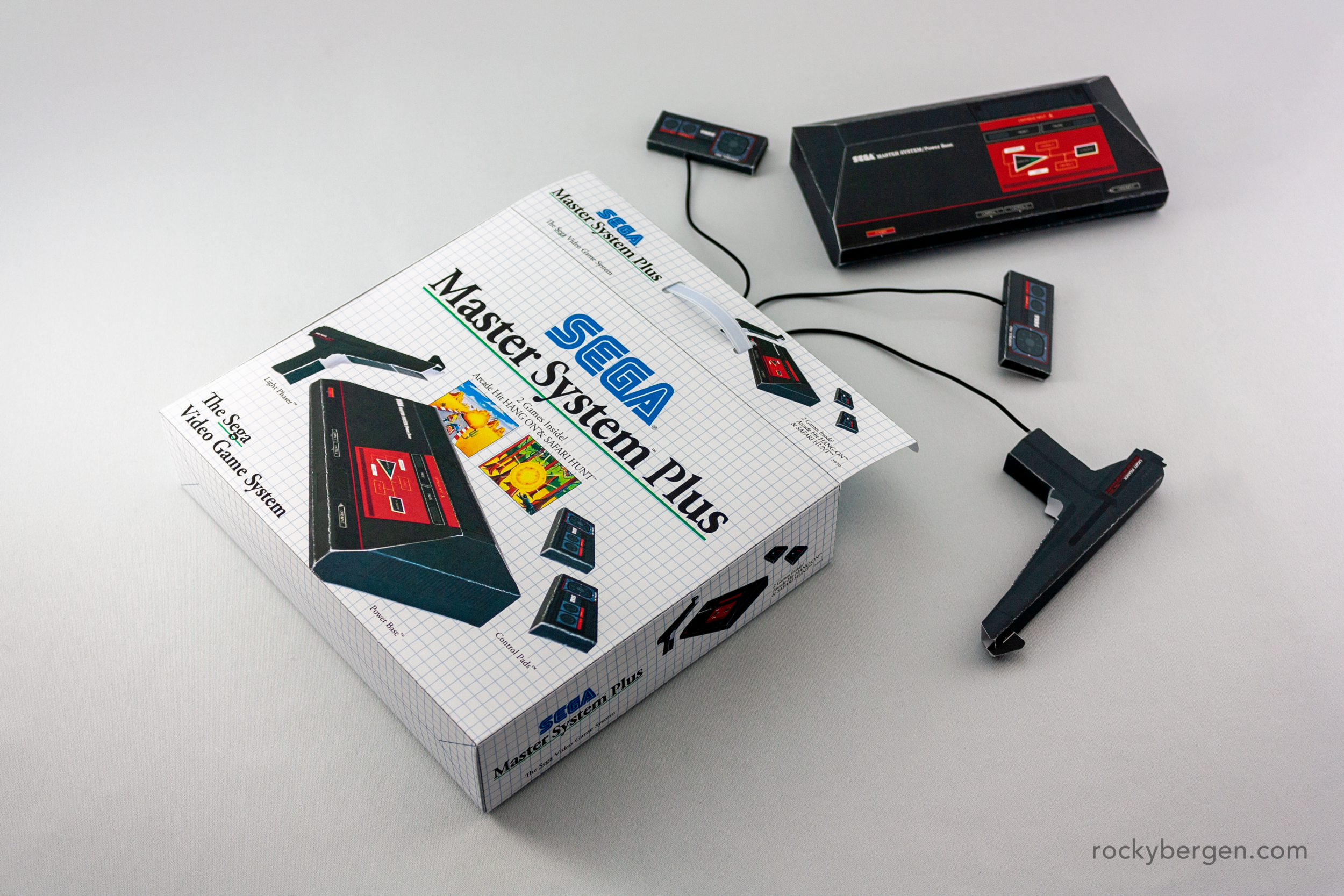
Box is included with this pattern!

Box is included with this pattern!

Rear of Box

Remember when systems came with TWO controllers.

I would be lying if I said I would have preferred growing up with the Master System, but that may have been mostly due to my community of friends sharing and talking about Nintendo games all day. I don't know what it would have been like being a silent Master System fan in the group. Maybe if on that fateful Christmas my parents had bought me a Sega Master System instead of an Nintendo Entertainment System I would have fallen in love with Alex Kidd and Phantasy Star, I know that as an adult I have.

Alex Kidd was one of Sega’s early mascot attempts, second to Opa Opa.

Sometimes I have little connection to the model I am designing and other times it part of a lifelong fascination. Whether it is something close to my heart or something “new” and exciting I am always happy to explore a different design language and share this experience with others in this unique way.

Happy holidays to everyone and if you like this article please consider sharing with a friend or leaving a comment! What should I design next?

The Sega Master System papercraft model can be downloaded here.

In sega, videogame, papercraft, Retro, paper craft, Design, art Tags Sega, Master System, SMS, Mark III, 1986, video game, pattern, design, papercraft, paperart

The Dancing Demon has as much character as an ASCII-type creature can have and made for an excellent if unofficial product mascot.

TRS-80 Model III - Papercraft Design

November 13, 2019

Some computers I know really well. I grew up around Apples and Commodores but when it comes to the Tandy / Radio Shack series of computers released throughout out the early half of the 80’s I don’t know much. When it came to Radio Shack computers I have always been more familiar with the Tandy PC Compatible series of computers released much later.

While the Model III was targeted towards the business market, I was pretty impressed with how effortlessly it was able to throw the ASCII-type graphics around the screen. The Dancing Demon, a new personal favorite, has delighted TRS-80 users for dozens of years now.

The system boot up.

Rear of the model is surprisingly clutter free, being largely a self contained design.

As with most systems from this era, manuals provided users with invaluable first steps.

Thanks to the wonders of RetroPie I have had an opportunity to try a number of games on the system. For a machine without any custom graphical capabilities, the TRS-80 has a pretty extensive lineup of games. While clearly primitive, the amount of expressiveness many of these games have is impressive.

A little too late for Halloween, but it is amazing how much character could be given to games produced with this machine.

While I did not grow up with this computer, Radio Shack’s TRS-80 series of computers has impressed me with its longevity as a platform and wide variety of games.

If you like “less common” systems like the Model III please consider leaving a like or a comment. Which system should I do next?

My next system will not be a computer but I will be something from my youth that promoted over the holidays and somthing I always wanted but did not get until I was much older.

You can download the TRS-80 Model III design here.

In paper craft, papercraft, Industrial Design, Design, Retro Tags TRS-80, Radio Shack, Tandy, computer, retrocomputer, Model III

I endeavored to make this image as period correct as Canadian could.

Sinclair ZX Spectrum - Papercraft Design

September 5, 2019

The ZX Spectrum was all but absent from the Canadian market in its heyday but that didn’t mean I wasn’t interested in the system. I have watched enough hours of gameplay on YouTube to get that many of the games developed in the UK were merciless usually requiring pixel perfect precision under cruel time constraints. While “Nintendo Hard" may be an honoured title amonthst many North American gamers, “ZX Spectrum Hard” appears to be on another level entirely.

Sir Clive is my favorite tech maverick.

Chucky Egg is pretty awesome.

When I design a new papercraft pattern I create the computer itself, any key peripherals and a monitor. The ZX Spectrum release pitch was that a family could save money by using a household television and portable cassette player over expensive proprietary devices.

Needing to think outside the box, I consulted the 1982 Dixons Summer Catologue and it recommended bundling “your new ZX Spectrum with the Contec KTN-3732 Portable Color TV and the Dixons TR12 Cassette Recorder”.

Sinclair ZX Spectrum - Computer and Dixon's Cassette Player

Contec televisions - Light and dark grey

Crosse & Blackwell - Baked Beans

Ant Attack is a cool looking game. Talented artists worked magic with the system.

To help keep you fueled while making this papercraft, I have also included a period-correct tin of Crosse & Blackwell Baked Beans.

If you like this post please consider sharing or leaving a like below.

Follow me on Twitter and Instagram for new papercraft design announcements.

You can download the Sinclair ZX Spectrum papercraft design here.

In zx spectrum, Retro, papercraft, paper craft, Industrial Design, Illustration, Design, art Tags sinclair, clive, zx spectrum, contec, dixons, paperart, papercraft, computer, retro, uk, british

I don’t know if it gets much more 90s than this!

Amiga 500 - NEW ART - Papercraft Design

August 8, 2019

The Amiga 500 NEW ART designs can be downloaded at the bottom of this post.

Thank you Germany for being such steadfast fans of the site! As a way of giving back to the community I have reproduced some very limited designs for the German market. This edition was designed in 1989 by a well-know television and radio presenter, Stefanie Tücking.

Readers with exceptional vision may have noticed that I have also adjusted the keyboard to the German layout. For those of you who prefer your German Amigas unadorned, I have also included a plain Jane Amiga 500 with this adjusted keyboard configuration in the pattern link below.

Grid Design

Leopard Print

My ultimate dream is to visit Germany and show my papercrafts at a (few) retro computing event. I always tell my girlfriend that’s when I will have made the “big time”. I live in Canada but my heart is in Germany. I would love to immerse myself in the German culture if only for a while.

Detail of the Grid design, please observe the German keyboard layout.

Detail of the Leopard Print design. I can’t decide which crazy design I like more!

Limited editions were certainly less prevalent in 90s which made them extra special. Nowadays, limited editions are released every week which seems less special to me.

If you like these papercrafts please consider leaving a like. I find the hearts very encouraging. Also consider following @rockasoo on both Twitter and Instagram to stay up to date with my papercraft projects.

You can download the Amiga 500 NEW ART papercraft here.
You can download the Amiga monitor and additional accessories here.

In Amiga, Commodore, Design, papercraft Tags amiga, 500, computer, retrocomputer, Commodore, paperart, papercraft

This was the first computer I used in high school. I was never impressed by the graphics and found it hard to believe this was ever going to overtake the almighty Amiga.

IBM 5150 - Papercraft Design

July 16, 2019

The link to the IBM 5150 pattern can be found at the end of this post.

I was so excited to get to high school because it was my first exposure to a real computer science class. My computer science teacher was the best kind of nerd who had an office full of exotica. Highlights included interrupting regular classes to show us how to communicate with nearby orbiting satellites, showing us VideoToaster vids, bringing out a chicklet-keyboard PET complete with 8” drives, and even comparing real Rolex’s from fakes. I don’t know if he ever realized the life-long impact these experiences would have on me but I hold them all dear to my heart.

Truthfully, I wasn’t very impressed with the IBMs. We had some XTs and a a few ATs. None of which had much for graphic capabilities. After cutting my teeth on the C64 and seeing what Amiga’s could do out-of the-box, it was pretty disappointing. Add to that the fact that I was not much of a programmer, and I knew that I might need to look elsewhere to find my bliss. Luckily, a year later we got our first Windows machine, a 286 and I discovered Desktop Publishing and I found my true passion.

All of my papercraft designs include changeable screens, so you can choose from a number of productivity programs including DOS and Wordstar!

Even though I never was satisfied with my early IBM exposure, I always wanted to learn as much as I could. I knew these machines were highly regarded and I had read about the troubles at Commodore so the writing was “on the screen”, the IBM series of computers were the likely future of personal computing.

I love making mini-accessories nearly as much as I love making mini-computers.

I love making mini-accessories nearly as much as I love making mini-computers.

Many years on and I still have a strong connection to the 5150’s industrial form factor. The machine was built like a tank and the simplicity and utility of the design transcends the 80’s. I have no doubt that if IBM wanted to get back into the consumer hardware game that they could seriously take some cues from the original.

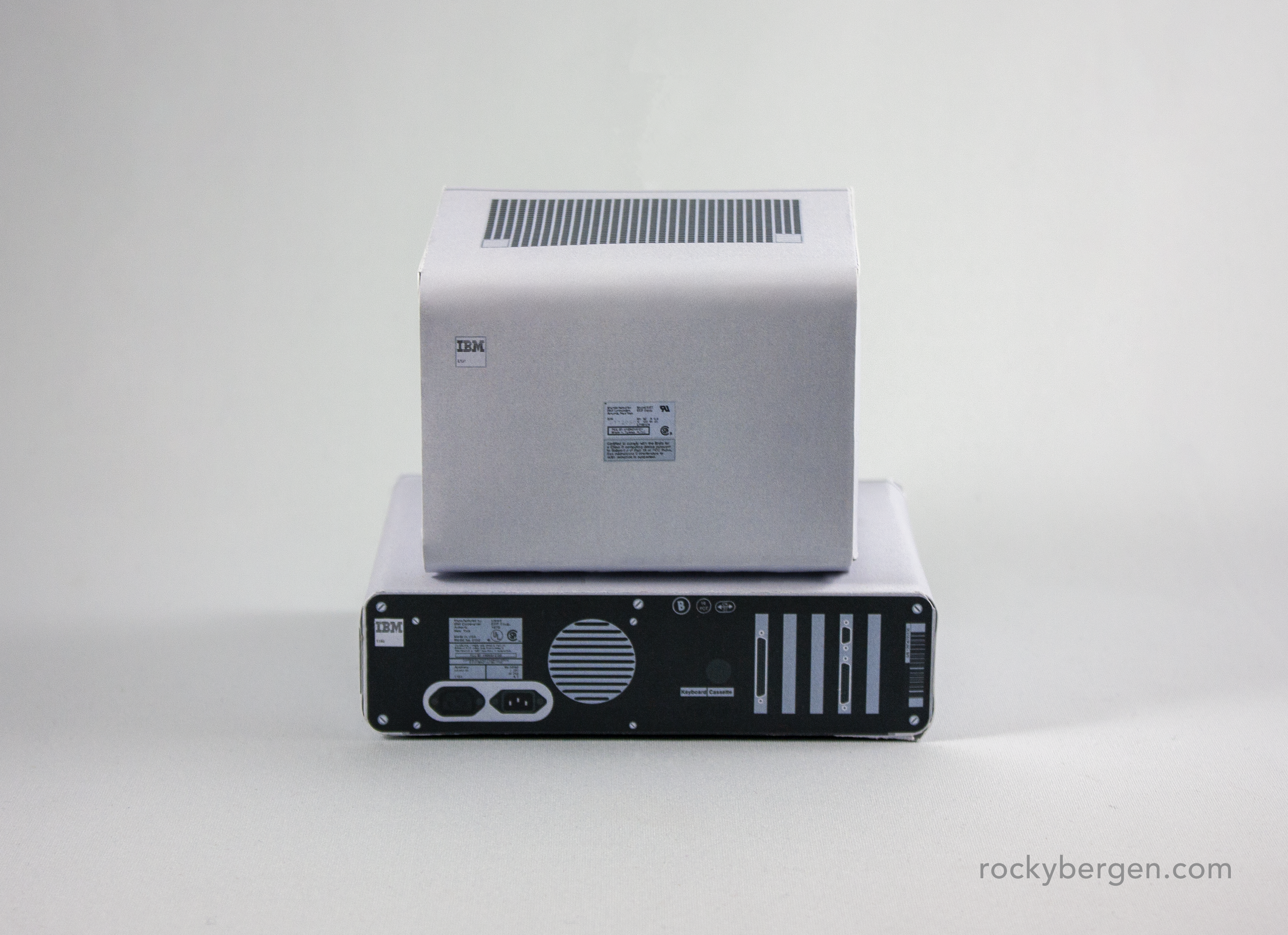
Rear view of the 5150.

Rear view of the 5150.

I hope you have as much fun assembling this papercraft as I had making it. I received a shout out from YouTube legend Clint, at Lazy Game Reviews today so it seemed like an appropriate time to make this post.

Thanks as always for all the love. If you’d like to see some more IBM stuff, be sure to slap that like button silly. I have something special for the German Amiga fans (any guesses?) coming soon.

You can download the IBM 5150 papercraft model here.

In ibm, papercraft, paper craft, Design Tags IBM, 5150, papercraft, paperart, computer, dos

Akumajou Dracula (Castlevania) for the Sharp X68000 was significant step up from what was possible from the Famicom - This version of the game was later released on the Playstation as Castlevania Chronicles.

Sharp X68000 - Papercraft Design

May 25, 2019

The pattern for the Sharp X68000 can be found at the bottom of this article.

I lived in Osaka, Japan roughly from 2000 - 2005 and I loved to visit Den Den Town, Osaka’s amazing electrics district. Thankfully for my pocketbook, I wasn’t a hardcore collector of video games at the time. I would usually visit the district to hunt for film photography gear (35mm and medium format, lomo), old Japanese pop mini CD-singles (Chara, UA, Spitz to name a few), and “collectable” Pepsiman bottletops. If you were in the market for Maid Cafe’s, Anime Shops, or 8 floors of pornography, it was all to be found in Den Den Town.

Even though vintage tech was not the mission, it did not prevent me from window shopping and drooling over the vintage tech. Den Den Town is the only place I have ever played a Vectrex or the Atari Jaguar. In the shops of Den Den Town, I was easily able to survey all the vintages of PC Engine, Nintendo’s Pong consoles, Wonderswans, and NEO GEOs, oh my!

Near perfect arcade ports were a mainstay of the X68000 - Here’s Bubble Bobble.

It was only once I got back to Canada and through YouTube, learned about the Sharp X68000. This machine is a real arcade powerhouse with it’s many arcade perfect ports. For years, I was relegated to listening to my favorite X68000 soundtracks like Overtake, Akumajo Dracula, Phalanx, Asuka120% Burning Fest, Genocide 2 and Magical Blocks Carat. Most of what I knew about the system was shrouded in mystery until I set up my RetroPie system. Now that I can play many of these games myself, I can agree that this machine would have been an amazing thing to behold back in that late 80’s when it was first released. Both my girlfriend and I love playing Bukame Death, an obscure X68000 exclusive.

Some of the best console ports came to the X68000 as well.

Speakers can be detached and placed beside the system.

A papercraft version of this machine is sufficient to scratch my itch to buy a machine of my own. Honestly, the logistics of running such exotic hardware outside of Japan is well beyond the scope of my time or money reserves.

Sound was another area where the X68000 excelled and Overtake is one of my favorite soundtracks to any racing game.

I don’t know if this model will have the ability to “Make Your Dream Come True” as advertised on the side of the case, but it’s a pretty fun activity and a great way to learn a little more about this standout system. This papercraft features interchangeable screens and detachable speakers so you can further customize your X68000 experience.

Download the Sharp X68000 papercraft HERE.

If you like this model and would like to see more papercraft models on my site, please consider leaving a like. It really helps me out!r

In sharp, Retro, videogame, papercraft, paper craft, Industrial Design, Design, art Tags sharp, x68000, computer, retrocomputer, arcade, paperart, papercraft, pattern, pepakura

The IMSAI 8080 was part of the PCS-80 System and various modules and cards could be added to expand functionality.

IMSAI 8080 (PCS-80 System) - Papercraft Design

March 29, 2019

I must admit I don’t have any personal history with any computers of this vintage. I was born in 1976, a few months after the IMSAI came out. I did not become interested in computers until the early 80s and the home market had changed drastically. The days of flashing lights and paddles were replaced by smaller practical systems that could hook up to your televisions.

A terminal can be added but I love the tiny monitor option against the dual 8” floppy drives.

The IMSAI 8080 used custom boards extensively and were generous with their expansion bays.

The IMSAI 8080, released in 1975 was a clone of the first personal computer, the MITS Altair 8800. This made the IMSAI the first personal computer clone. I know these systems were often used as CP/M machines but who beyond the well-to-do and die-hard enthusiasts would have found a use for one of these systems in these early days is unclear to me.

I really don’t know what I would do with this box but I would adore the vintage led lights.

I really don’t know what I would do with this box but I would adore the vintage led lights.

These machines are undeniably unique and were a please to craft in paper. Please give it a try if you would like to hold a tiny piece of computing history in you own hands. Please leave a like and plenty more vintage computer goodness is on the way!

Download the IMSAI 8080 papercraft pattern here.

In IMSAI, Retro, papercraft, paper craft, Industrial Design, Design Tags IMSAI, IMSAI 8080, PCS-80, PCS-80 System, papercraft, design, pattern, industrial design

The AVS was Nintendo’s first concept for a western 8-bit console based off of the Famicom.

Nintendo AVS (1985 Prototype) - Papercraft Design

March 4, 2019

It's hard to imagine a time when Nintendo was not a household name but in 1985 the company was widely unknown to western audiences. The Nintendo Famicom had released in Japan almost two years earlier and took the country by storm. Looking to expand their successes in other markets Nintendo was looking to partner with a company to develop a Famicom for the west.

Nintendo had initially teamed up with gaming-giant Atari in 1984 to help develop and market the Nintendo’s console. Atari was not convinced that Nintendo could succeed and used this agreement to stall Nintendo's 8-bit development in North America while secretrly developing their own "next-generation" 8-bit console, the 7800.

Nintendo, desperate to find distribution partners, took their prototype to the 1985 Consumer’s Electronics Show (CES) in Las Vegas. This prototype was called the Nintendo Advanced Video System or AVS.

You can assemble your own free paper Nintendo AVS model which can be found at the end of this post.

“The evolution of a species is now complete.”

Nintendo marketed the AVS as an evolution in the gaming industry making reference to the law's of survival in the animal kingdom in their promotional materials. The AVS promised graphics that would appear three-dimensional, challenging gameplay and a system designed to fit in with existing hi-fi equipment. This system was no mere plaything - this was serious business.

“Introducing the Nintendo® Advanced Video System™.”

While internally not much different from the Japanese Famicom or the NES that would eventually be released, the AVS featured many accessories meant to make it feel more like a home computer than a games console. The game crash of 1983 had killed consumer confidence in game consoles and western hardware developers were looking for ways to revive the industry. Home computers were a rapidly growing market in the mid-80's, so it was common for computer companies at the time to boast the additional benefits of educational and productivity titles as an incentives to purchase a computer over a game console.

“It’s the only system you can buy with no strings attached.”

The AVS was intended to be a completely wireless device. One of the common complaints of games consoles in the 80's was the mess of wires that invaded living room. The joysticks, light gun, data recorder and keyboards were all connected to the system via an infrared connection. The only wires involved would be one to power the system and one to connect to the television. The idea being, by creating a completely wireless setup, the AVS would be easier for parents to clean around.

“It can play the best games.”

While not naming any names, Nintendo slyly compares their competition’s graphics to primitive cave paintings. The marketing of the AVS relies heavily on the idea that games would appear more dimensional through the use of colour, perspective and shadow. While these claims may seem a little grandiose in 2019, it was hard to argue that the graphics this new machine were a cut above what had been previously seen on any home console.

“It can play target games.”

The AVS light gun could be converted into a wand or pointing device similar to a Wii controller. This was the first time consumers were able to interact with their home televisions in this way. By converting from a gun to a wand, the controller’s functionality could be extended to a pointer, sword or wand-like device.

“It can create new games.”

The idea of going beyond a passive gaming experience was key to Nintendo’s marketing strategies for the AVS. For the first time ever on a home console you would be able to build you own courses in Excitebike and save them to your data recorder to play another day. Nintendo had recently released Famicom BASIC (and keyboard) in Japan and planned to bring it to the AVS with the promise of teaching you step-by-step how to code your own BASIC games for the system.

“It can even play music.”

The Famicom’s sound chip allowed for a wider range of audio than the competition at the time. By contrast to the AVS’s multi-channel audio, the new Atari 7800 system was still using the same tired sound chips Atari used in the 2600 back in 1977.

The Nintendo keyboard was playable without a connection the the AVS with its own built-in speaker and integrated sound chips. When connected to the AVS, the system could visualize the notes played and provide music lessons. The data recorder could be used to record and playback these sessions.

“Which is why 90% of the Japanese market won’t play anything else.”

Nintendo had a clear lead over Sega’s aging SG series. The Sega Mark III which came out later 1985 did little to interrupt Nintendo’s early 8-bit console dominance in Japan. Nintendo promised to take everything that had made the Famicom a success in Japan and make it even better for the western release. Nintendo had gone a bit crazy with accessories for the Famicom so they already had developed a keyboard, data recorder and Famicom BASIC, all of which would be enhanced for the west.

The AVS, the system we could have known.

When Nintendo released the Nintendo Entertainment System later that same year, most of the next-geneation bells and whistles were simplified or removed from the AVS prototype to focus on Nintendo’s core strength, its games. Instead of becoming an early multi-media catch-all, Nintendo went in the complete opposite direction and adopted a model of quality and simplicity. Nintendo chose to ignore the buzz that consumers wanted home computers and decided to create a console experience people would want.

At the end of the day it is hard to argue the success the NES had in North America and many parts of the world (UK gamers, I know, I know..) but I have to wonder what the market might look like today if the AVS had come to out as first envisioned. The biggest difference between a home computer and a home console in 1985 was its marketing. By limiting the user experience to playing games on the NES, Nintendo was able to build partnerships with many excellent developers and focus on creating high-quality, exclusive titles. It was the NES’s simplicity of use and selection of games that ultimately won back old consumers and helped grow the industry we know today.

Keyboard, Data Recorder, and Console - stacked with cover (front)

Keyboard, Data Recorder, and Console - stacked with cover (rear)

The AVS was stackable in order to save space in an entertainment system when not in use. A keyboard cover would sit on the top of the stack creating a clean appearance. Note the lack of external connections on the rear of the unit as all the connections would be made via RF. Both the keyboard and data recorder were battery powered.

Nintendo Basic

While Nintendo BASIC did not appear in Nintendo’s promotional materials, I mocked-up a few additional support items to help further imagine what AVS carts might have looked like.

Famicom carts mocked to match the NES cart colours and artwork seen on early releases.

The AVS zapper could be converted to a pointing device.

This papercraft is also transformable.

I think my paper models do a good job of connecting people with their personal nostalgia for computers in their past. I also feel that though the filter of paper, all of these fantastic machines becomes equally possible. Even though this machine only exists as a single prototype on display at Nintendo of America’s New York headquarters, you can now print out and exhibit your very own AVS.

If you liked this post please consider leaving a like (it makes me very happy) and follow me at @rockasoo on everything.

You can download the Nintendo AVS pattern here.

In Nintendo, papercraft, Prototype, Industrial Design, Design, art, videogame Tags NES, Nintendo, avs, prototype, papercraft, paperart, design, industrial design, Living Room
Older Posts →

Latest & Greatest

Featured
Mar 5, 2022
Bergen - Arduwatch Design
Mar 5, 2022
Mar 5, 2022
Feb 26, 2022
Book Box - Mini Outdoor Community Libraries
Feb 26, 2022
Feb 26, 2022
Feb 12, 2022
Cat Pod - Cat Shelter Design
Feb 12, 2022
Feb 12, 2022
Feb 5, 2022
Commodore 65 - Laptop Design - 65-LT
Feb 5, 2022
Feb 5, 2022
Feb 5, 2022
Commodore PET Keyboard Design
Feb 5, 2022
Feb 5, 2022
Jun 20, 2021
Bergen Watches - New Vintage Chronograph Design WIP
Jun 20, 2021
Jun 20, 2021
Jun 12, 2021
Amiga Cartoon Classics Papercraft
Jun 12, 2021
Jun 12, 2021
Jun 11, 2021
Waxwings in our back yard
Jun 11, 2021
Jun 11, 2021
Feb 14, 2021
Commodore PET/CBM 2001 - Papercraft Design
Feb 14, 2021
Feb 14, 2021
Feb 14, 2021
Bergen - New Vintage Chronograph Design
Feb 14, 2021
Feb 14, 2021

Get In Touch

let's talk about Great design!

A collection of illustrations, designs, other art, and the occasional meandering. If you are interested in working with me please have a look at my portfolio and feel free to drop me a line!

Powered by Squarespace